Screenshots
A visual tour of the dashboard. Every image below is the live demo stack (--profile demo) seeded with the curated demo dataset — exactly what you get from the Quickstart. Toggle the site's light/dark switch and the matrix and swimlane shots follow.
Deployment matrix
The default view: one row per service, one column per environment. Each tile carries version, status (success / in-progress / failure), actor, commit, elapsed time, and a link to the CI/CD run. KPIs across the top summarise services, environments, in-flight, and failed counts.


Swimlanes
A per-service graph view: see how a version flows from dev through qa, staging, preprod, and prod, with branching topology and status-colored edges.


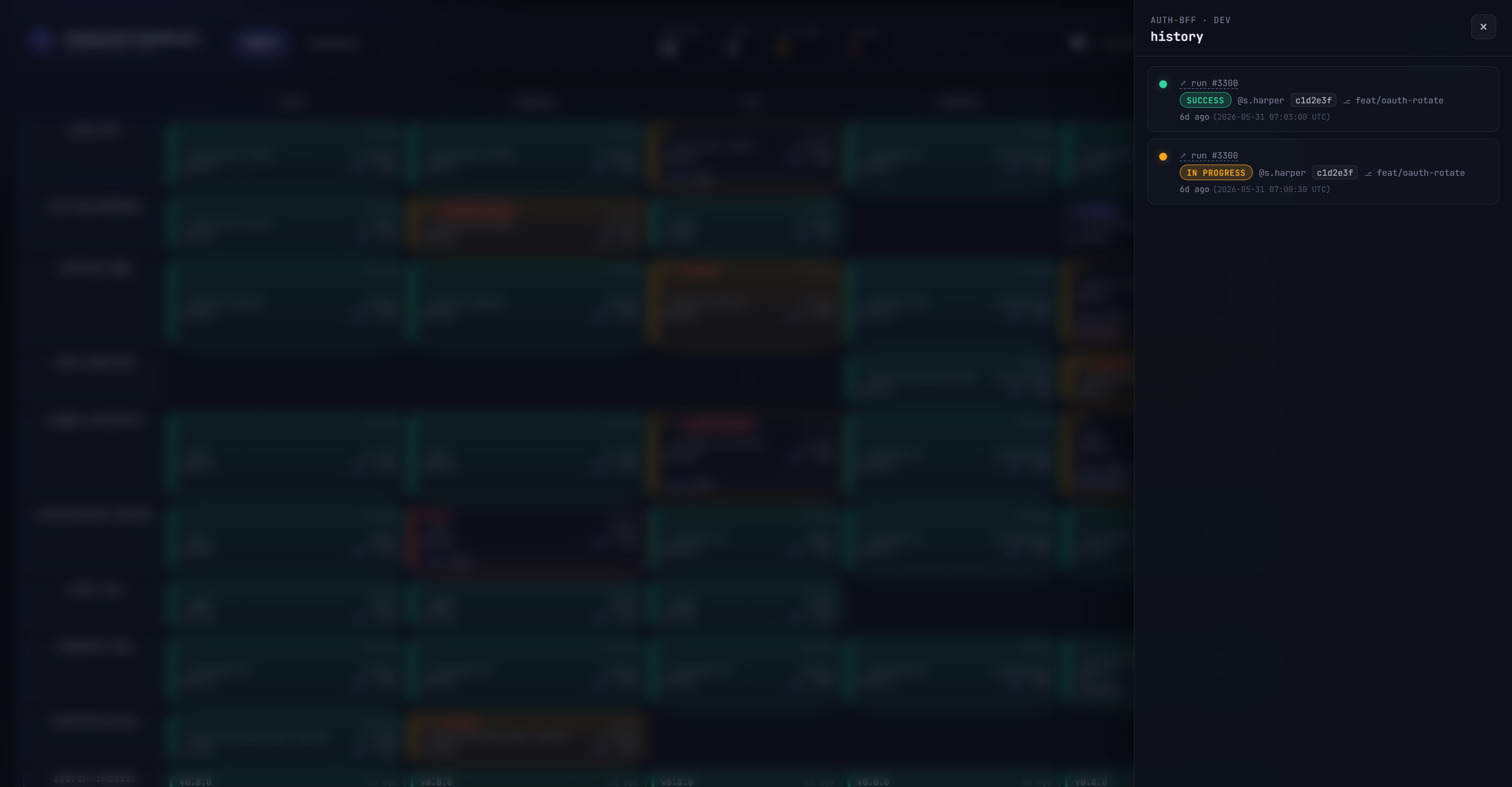
History drawer
Click any slot to open its full deployment history — every event ever recorded for that (service, environment), newest first, with status, version, actor, commit, and run reference.
Analytics
A DORA-anchored analytics view covering the last 7, 14, or 30 days (bounded by HISTORY_RETENTION_DAYS). The KPI band at the top surfaces the four DORA keys — deployment frequency, lead time (approximated from promotion chains), change failure rate, and mean time to restore — followed by eight charts: deployment frequency over time, change-failure-rate trend, deployment-duration distribution (p50/p95), promotion funnel, status distribution, deploy heatmap (day-of-week × hour), top deployers, and time-to-restore incidents.


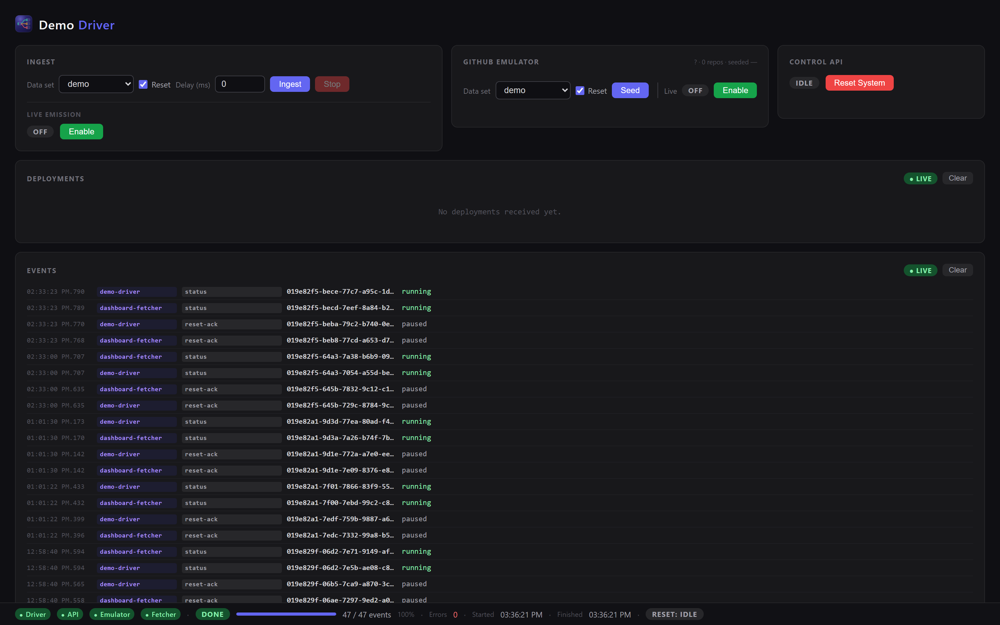
Demo control panel
The demo profile ships a Demo Driver control panel (/demo/): ingest the curated or random dataset, seed the GitHub emulator, drive live emission, trigger a system reset, and watch the deployment feed and component event streams in real time.
Want to see it for yourself? It's one command: